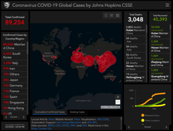
Interactive map from Johns Hopkins shows coronavirus spread in real-time

By March 2, 2020News
Coronavirus COVID 19 2019 nCoV

Coronavirus COVID 19 2019 nCoV

The map allows you to see which parts of the world are impacted the most by it.

A chart is placed to the left of the map showing the number of confirmed cases for specific countries, states, and cities.

Two charts are placed to the right of the map.

Image: https://www.arcgis.com/

{iframe}https://www.click2houston.com/news/national/2020/02/29/interactive-map-from-johns-hopkins-shows-coronavirus-spread-in-real-time/{/iframe}

Leave a Reply

You have successfully subscribed to the newsletter

There was an error while trying to send your request. Please try again.

BioHealth Innovation will use the information you provide on this form to be in touch with you and to provide updates and marketing.