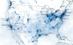
These 8 maps show the massive drop in smog caused by the coronavirus

By April 13, 2020News
These 8 maps show the massive drop in smog caused by the coronavirus

These 8 maps show the massive drop in smog caused by the coronavirus

As streets have emptied of traffic during the coronavirus crisis and airlines have cut flights, the changes have temporarily helped another public health crisis—air pollution. In the Northeastern U.S., nitrogen dioxide pollution (the air pollution caused  by internal combustion engines burning fossil fuels) fell 30% in March as lockdowns began. Los Angeles’s usual smog has nearly disappeared. The same pattern happened earlier in China and Italy as mobility slowed, factories shut down, and hazy skies cleared.

Image: These maps show the air pollution levels in late March 2019 and the late March 2020. Map: courtesy Descartes Labs

{iframe}https://www.fastcompany.com/90489321/these-8-maps-show-the-massive-drop-in-smog-caused-by-the-coronavirus?utm_campaign=eem524%3A524%3As00%3A20200413_fc&utm_medium=Compass&utm_source=newsletter{/iframe}

You have successfully subscribed to the newsletter

There was an error while trying to send your request. Please try again.

BioHealth Innovation will use the information you provide on this form to be in touch with you and to provide updates and marketing.