The best, and the worst, of the coronavirus dashboards – MIT Technology Review

By March 9, 2020News
NewImage

NewImage

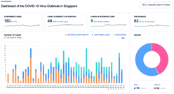
If you’ve been on the web to learn more about the latest pandemic, chances are you’ve stumbled upon at least one or two coronavirus dashboards. These are the landing pages for interactive maps and visuals that show where the virus has spread, as well as numbers on the latest in infection rates and deaths, breakdowns of what countries are suffering from new cases and what regions are likely seeing new outbreaks, and much more.

Image: UPCODE ACADEMY

{iframe}https://www.technologyreview.com/s/615330/best-worst-coronavirus-dashboards/?truid=8e083dbbf9d0e6d0e8489f19e7d011d2&utm_source=the_download&utm_medium=email&utm_campaign=the_download.unpaid.engagement&utm_content=03-09-2020{/iframe}

Leave a Reply

You have successfully subscribed to the newsletter

There was an error while trying to send your request. Please try again.

BioHealth Innovation will use the information you provide on this form to be in touch with you and to provide updates and marketing.